Inbox overflowing with emails? Yeah, it’s a common sight, and let’s be real, we’re not opening all of them, never mind actually reading or clicking. 🫣
As a creative entrepreneur or small business owner, standing out in this email jungle can feel like a big task. But guess what? It doesn’t have to be that tough! The people signing up for your email list are already curious about what you have to offer. Unlike those countless Facebook or Instagram ads that pop up all the time, email marketing lets you lead potential customers on a journey to becoming actual fans!
It all begins with choosing the right email marketing tool, so you can send messages that really resonate with your audience. There’s no one-size-fits-all solution here.
In this blog, I’m going to walk you through two email marketing tools I’ve used for years: Flodesk vs Mailchimp. I’ll break down the pros and cons of each and share why I ended up choosing Flodesk and never looked back. Keep on reading! 👀
Mailchimp: the popular pick
When you first dive into the world of email marketing, it’s hard to overlook Mailchimp. It’s a name that pops up often, especially among beginners just getting their feet wet in online marketing. With a free starter option, it’s easy to test the waters without diving into your wallet too deeply.
But let me share my experience. While Mailchimp’s free plan is a great starting point, I felt the need for more creative freedom. I wanted to create emails that not only matched my brand but also stand out in the crowd. That’s when I discovered Flodesk!
Flodesk: where creativity thrives!
As soon as I joined Flodesk, I was amazed by how fantastic their interface and features were. 😍 It completely transformed my experience, and there’s no way I’m switching back!
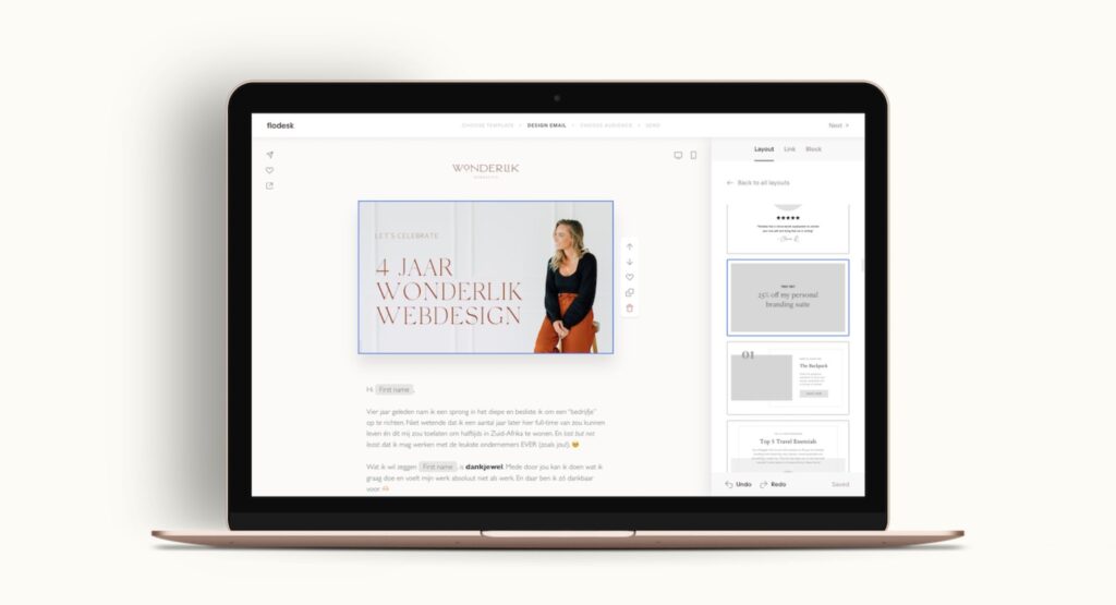
The real standout feature compared to Mailchimp? It’s the customization magic that comes with it. With Flodesk, you can craft emails that genuinely reflect your brand, playing around with your unique colors, fonts, and layouts – AKA: the full creative experience. 🎨
Stick around to uncover more reasons why Flodesk is my go-to choice for creative entrepreneurs looking to create stunning emails!
Flodesk vs. Mailchimp: pricing 💸
Let’s talk about one of the biggest questions entrepreneurs ask when choosing an email marketing platform: How much is this going to cost me?
And to be fair, Flodesk and Mailchimp’s pricing is actually pretty similar these days. Both charge based on how many subscribers you have. The more your list grows, the more your plan will cost. Totally normal.
Here’s what Flodesk’s pricing looks like (for up to 1000 subscribers):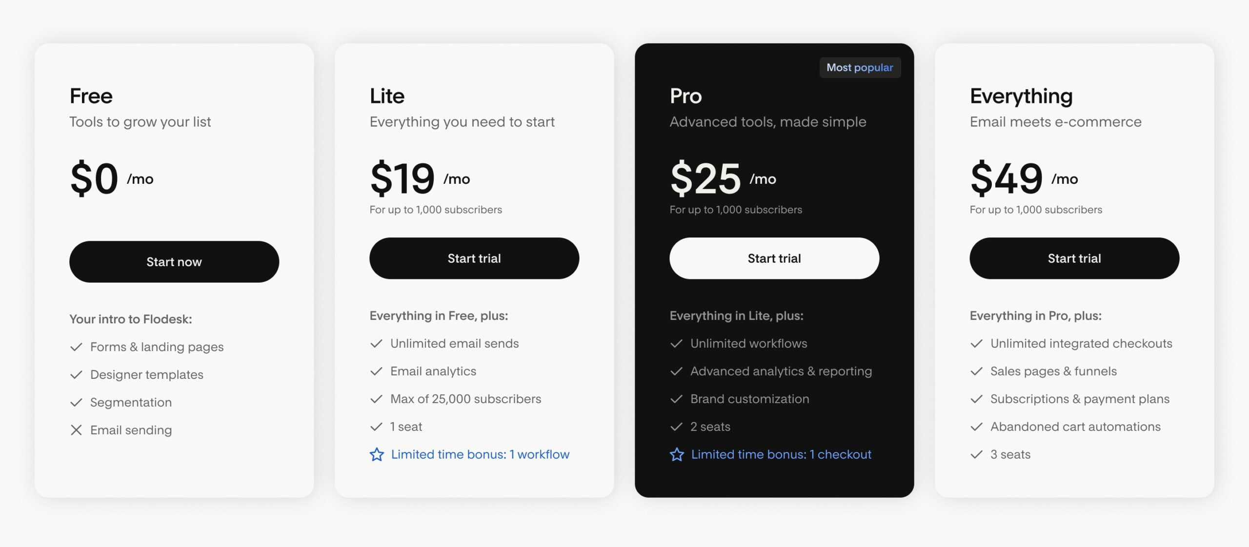
And here’s a quick overview of Mailchimp’s pricing (for up to 500 subscribers):
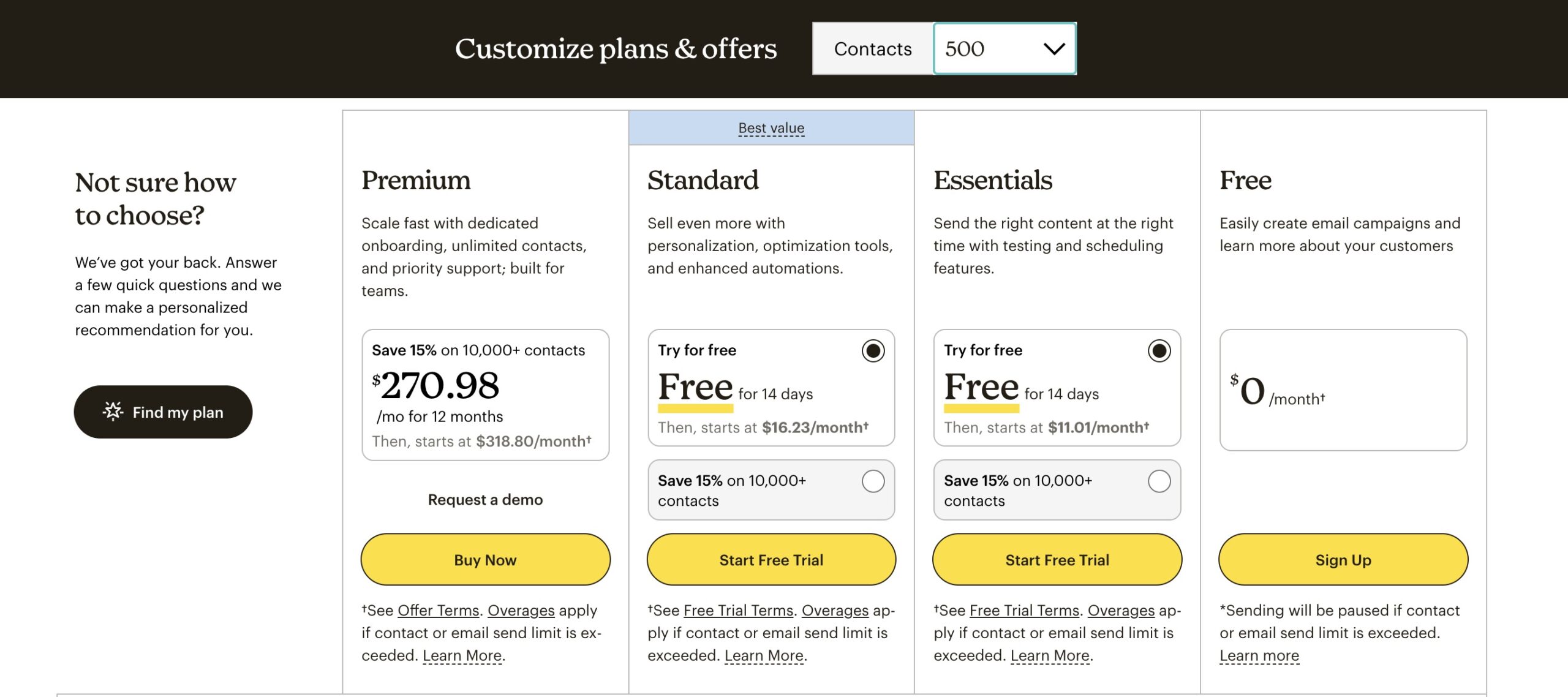
But here’s the thing: Flodesk gives you more freedom, fewer limitations, and a much better user experience – which makes the cost feel far more worth it as your business grows.
Here’s a little secret: use the code WONDERLIK and enjoy 25% off your first year of Flodesk! 🎁
I genuinely believe investing in Flodesk pays off – especially if design, branding, and ease of use matter to you.
Curious what else makes Flodesk my go-to choice?
Stick around… it gets even better. 👇🏻
Flodesk vs. Mailchimp: design possibilities 🎨
Here’s why Flodesk really stands out for me: its amazing design capabilities.
As a creative entrepreneur, you want each email to truly reflect your brand, right? It’s important that potential clients recognize you immediately. And honestly, a visually striking email will always outshine those dull, generic ones cluttering up inboxes.
Mailchimp: limited design options
When you’re exploring MailChimp, you’ll quickly find that the design options are quite limited. There are just a handful of templates to pick from, and honestly, they’re not the most thrilling choices out there.
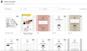
If you’re looking to jazz up your templates on Mailchimp, you’ll likely need to upgrade. However, even with an upgrade, it’s clear that they have room for improvement compared to Flodesk. You’re still unable to use custom fonts or change icon colors beyond the standard black, white, gray, or Mailchimp’s default options – not exactly a recipe for creativity, right? 🤔
Flodesk: tailor emails to your brand
With Flodesk, you’ve got access to a range of templates that are not only easy on the eyes but also super simple to customize.
And guess what? You can explore my very own Flodesk email templates, designed to seamlessly match the Showit website templates from my shop. It’s like a match made in design heaven! 😍

Flodesk offers a world of customization options:
- You can upload your own fonts
- Say goodbye to Flodesk branding in your emails
- Play around with icon & element colors to get them just right
- Add videos to your website
- … and so much more!
Flodesk vs. Mailchimp: ease of use👩🏼💻
oth platforms make it easy to get started with their user-friendly interfaces. Personally, I find Flodesk a bit easier to navigate, but that is just my preference. The drag & drop builder is a fantastic feature available on both Flodesk and Mailchimp for crafting your emails.
However, as I mentioned before, Mailchimp is more limited in terms of custimization options.
Flodesk vs. Mailchimp: support 🫶🏻
Customer support is a big deal for me and my clients – I’m sure you feel the same!
Flodesk’s support team is always there for you. When you send them an email, they promise to respond within 2 business days – but in my experience, it’s often quicker. Plus, there’s a private Facebook community where you can connect with other Flodesk users. It’s a great place to get tips, solve problems together and even get answers from the active team members.
Now, with Mailchimp, it’s a bit different. On their free plan, you only get support for the first 30 days. After that, you’re pretty much on your own. If you upgrade to a paid plan, you’ll have access to email or chat support, but remember: those who invest more get front-of-the-line service.
Flodesk vs. Mailchimp: features and integrations ⚙️
In addition to email marketing, both Flodesk and Mailchimp offer a number of other features. Let me break it down for you:
Flodesk features |
Mailchimp features |
|
|
Start your free trial with Flodesk
Curious about Flodesk? Start your 30-day free trial now! And if you decide to stick around, be sure to use the code WONDERLIK to get 25% off your first year of Flodesk! 🎁
Discover the Flodesk email templates
If you’re pumped about Flodesk, definitely take a look at my Flodesk email templates. They seamlessly match the Showit website templates in my shop. If you’re already using them, it’s a match made in heaven! 🧡

Ever wondered what tools I rely on daily to keep my website, marketing and workflow running smoothly? I've put together a list just for you so you can spend more time doing what you truly love!
My favorite tools & resources for creatives
Read more ...
